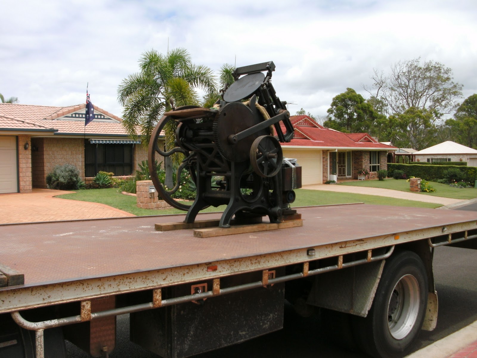
Well, I has been an eventful 2 weeks! Australia Day, Back to school, Valentines day promotions, a new press (more to come on the new press)
(I apologise for the boastful pats on the back but this is good form my self esteem!)
Here are some places Fluid Ink has been notice!
Etsy Face Book (betst # of hits from this!)
Etsy Australia weekly digest newsletter:
Etsy Finds Daily newsletter 27/01:
Madeit weekly newsletter Tuesday 31/01- featuring green tree of life card:
Etsy Front Page Monday 30/01
Friday, February 3, 2012
Wednesday, February 1, 2012
Designing for letterpress
Thinks to keep in mind when designing for letterpress
Taken from Boxcar Press
WIDTH OF LINES: Lines should be .25 point (or .003”) or thicker please! No hairlines!
FONTS: Letterpress excels at printing type and handles most fonts very well. We recommend using type no smaller than 6 point.
NUMBER OF INKS: letterpress printing traditionally uses 1 or 2 spot colors; 3 or 4 spot colors make for an extravagant and lavish production.
SCREENS: Letterpress excels at printing colors at 100%. If you’d like to incorporate a lighter color, we recommend using a second lighter ink color instead of a screen. Screens are more suited for offset printing, not letterpress.
REVERSE TYPE: Depending on the size of the reverse type, your reverses can clog up on the press. Because of this, we recommend a type size of 12 point or larger for reverse type, though this does vary depending on the typeface that you use. You may have to add a small stroke to the reverse type to compensate for letterpress ink gain. Also, if we're printing text and the solid area around your reverse type in the same color, we may need to print the solid area in a separate print run. Extra press runs do increase the cost of printing.
LIGHT INK ON DARK PAPER: With letterpress, we tend to print dark ink on light paper, because that is letterpress printing’s strength! Light ink on dark paper is really best suited for engraving. When a client wants to incorporate a darker color, we might suggest printing an offset flood on the back side of a light colored paper, or duplexing a dark colored paper to a light colored paper. That said, if you really want light ink on dark paper, just be prepared for paper show through. With letterpress, we use translucent inks. Printing light ink on dark paper will be like using a thin coat of white paint on a brown wall: you’ll see the brown color through the paint. If using a pure white ink or metallic ink, we can run a piece through the press twice, at an additional cost, to create a more dense color.
LARGE SOLIDS (large solids are areas larger than 0.7cm thick):Letterpress printed solids look different from offset printed solids. The paper tends to show through large solids, creating a slightly textured look that’s almost suede-like (we think this is a beautiful look by the way!). If you have a large solid and thin text in the same color, we’ll need to print the solid in a separate press run, to give the text a good deep impression and proper inking. Extra press runs do increase the cost of printing. Large solid areas can cause buckling of the paper, especially if using a thinner machine-made paper stock. You’ll also notice the depth of impression may appear less noticeable on really large letterpress solids—it doesn't have the contrast that line-art or type would have.
Saturday, January 21, 2012
Monday, January 9, 2012
Valentines day cards
....lets see if I can get it together and print out some of these deigns...
These are the Illustrator concept designs.
Some are using elements from other designs and changing colour and adding text, others are new designs that I have had polymer plates made recently for.
My issue is now producing...
These are the Illustrator concept designs.
Some are using elements from other designs and changing colour and adding text, others are new designs that I have had polymer plates made recently for.
My issue is now producing...
Thursday, January 5, 2012
Engagement invitations
Latest job.
Am really excited and pleased with the way they turned out!
A variation of the square doily save the date cards.
Printed 2 colour c6 size.
Custom text from polymer plates.
Printed on crane's lettra.
Envelopes plain white with doily pressed in blue into the corner.
The doily pattern was printed across the long edge of a5 and the cut in half to make c6, the text was then printed onto the individual c6 cards so 3 passes in total.
Things I learned...
- Where the sweet spot is on my Pearl press.
- Ink has an amazing colour variation depending on paper texture and colour - the blue of the small doily printed onto the envelope looks completely different to me - although husband did not think it was that different, it frustrated me slightly.
- Printing text straight is difficult. I ended up re-cutting around 1/4 of the job to straighten the text up (ie cut around whole card so text was straight on page) this reduced the size of the invite only slightly and is much more effective than printing heaps more in an attempt to get them straight.
ETSY wedding email digest - Im there baby!
click HERE to see the full newsletter
Ok so you may have to look hard for it, but Im in the 'yellow' colour section.
enlargement below:

Ok so you may have to look hard for it, but Im in the 'yellow' colour section.
enlargement below:

Tuesday, January 3, 2012
Moving a Chandler and Price letterpress to Perth Western Australia
http://excelsiorpress.org/reference_html/movingapresssafely.html
Some useful instructions on how to transport a press.
Am worried.
Points to note:
Some of the key points were: dont use a fork lift, dont use a tail lift truck - both things that I need to use with transporting across the country.
Am going to post on Briar Press forum http://www.briarpress.org/ and ask for advice on transporting across the country rather than DIY transport as this (DIY) is what most of the information is about.
Blind faith...dont fail me now...
Some useful instructions on how to transport a press.
Am worried.
Points to note:
- the press weighs: 2,500 lbs give or take a few hundred - make sure the tail lift is rated for this
- forklifts jostle and bump around so try to avoid
- cast iron is fragile
- tie down with ratchet straps
- close platen, fix flywheel so it doesn't spin
- make sure trailor/cabin has tie down points to stop press from skidding around.
- I think it needs to go on a pallet
Some of the key points were: dont use a fork lift, dont use a tail lift truck - both things that I need to use with transporting across the country.
Am going to post on Briar Press forum http://www.briarpress.org/ and ask for advice on transporting across the country rather than DIY transport as this (DIY) is what most of the information is about.
Blind faith...dont fail me now...
Subscribe to:
Posts (Atom)